In Education, where vast quantities of assessment data are collected and used for the purposes of accountability, it is inevitable that schools will be placed into categories of performance based on their results. Log in to ASP or any of the other myriad school standards reports and you are likely to see eye-catching red and green boxes with accompanying statements that seek to summarise a cohort’s progress in a few short words. Now, with the recent publication of accountability guidance and Ofsted’s Inspection Data Summary Report (IDSR), and the impending release of results in the Analyse School Performance (ASP) system, it’s worth reminding ourselves of the progress bands and how schools end up in the one they’re in. Fortunately, it’s perfectly straightforward, consistent, and easy to understand.
I’m kidding. It’s a nightmare.
Let’s start with the accountability guidance. The recently published Primary School Accountability in 2022 technical guide provides this table on page 29.
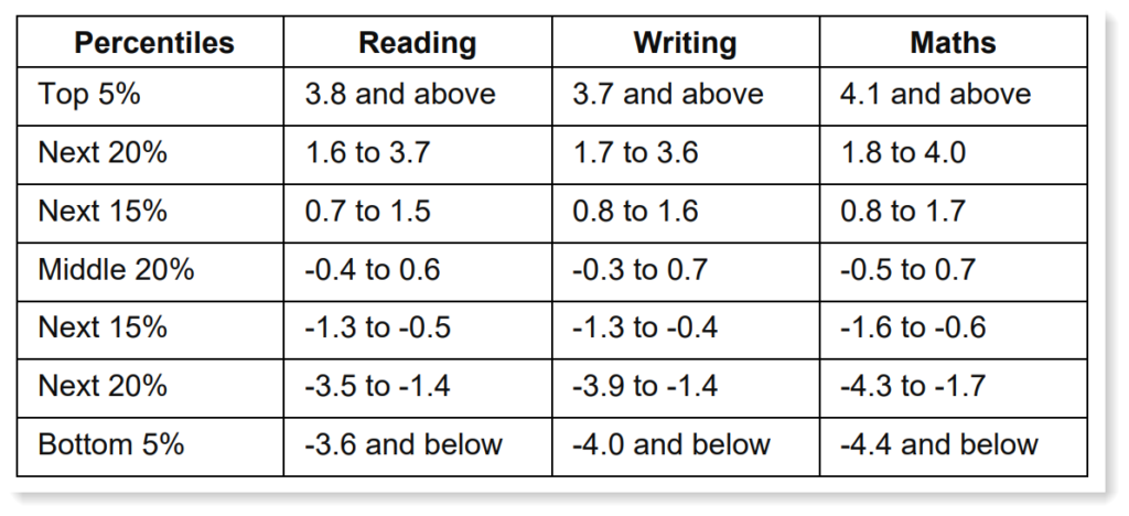
This tells us, for example, that a school with a progress score of -1.4 or lower in reading is in the bottom 25% of schools, which may be of interest. Unfortunately, those thresholds are not used for anything.
Let’s turn instead to the IDSR guidance. Here we’re told that the school’s progress is categorised – i.e. a sentence on the IDSR ‘will be triggered’ – if:
“the progress score for all pupils is in the bottom or top quintile and the score is significantly different to the national score“
Ofsted therefore use a combination of a statistical test and percentile rank to categorise school performance. The progress score must be significantly above/below national average AND in the top/bottom 20% to be identified as high/low performing. This differs significantly (pardon the pun!) from the pure threshold approach presented in the accountability guidance because a) it involves a confidence interval, and b) it concentrates on the top and bottom 20%, the thresholds for which aren’t even provided in the table above.
It’s the use of the confidence interval that can really bake one’s noodle. Intended to afford fairer comparisons between schools of different sizes where the impact of one pupil can vary greatly, it means that schools with the same progress score can end up in different progress bands (unlike if we were to rely on the table in the accountability guidance). It also means that a larger school with a lower progress score could be identified as higher performing than a smaller school with a higher progress score. Or a larger school with a less negative progress score ends up with a red box and a ‘sentence triggered’ whilst a smaller school with a bigger negative score avoids the cut. If we look back at the table above, a school with a progress score of -1.4 (just in the bottom 25% by that definition) cannot be identified as lower performing in the IDSR because they do not meet the threshold criteria, but they may or may not be significantly below average depending on their size and the width of the confidence interval, and maybe identified as lower performing in a different report.
The best way to view confidence intervals is as follows:
A confidence interval that is entirely above the 0 (average) line indicates that the progress score is significantly above average. A confidence interval that is entirely below the 0 line means indicates that the progress score is significantly below average. Progress is in line with average if the confidence interval straddles the 0 line.
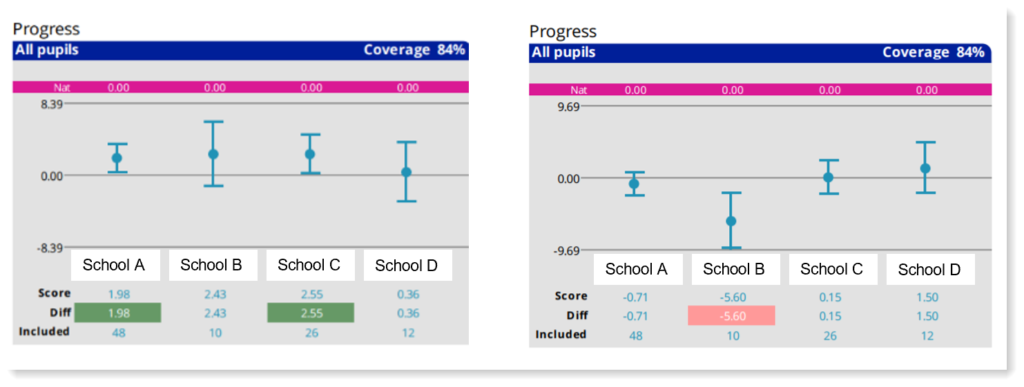
Here we can see School A has a progress score of 1.98, which is lower than School B’s score of 2.43. However, due to its larger cohort size, School A has a narrower interval. Because the interval sits entirely above the 0 (average) line, progress is therefore deemed to be significantly above average. The school may or may not be identified as higher performing in the IDSR because we don’t know if a score of 1.98 places the school in the top 20%, just that it’s in the top 25%. We certainly can’t glean that information from the accountability guidance because its doesn’t provide the 20% threshold, but we’ll soon know once we open the IDSR and start scanning the narrative.
And what about ASP and the performance tables? They use confidence intervals, right?
Yep.
So, that’s the same as the IDSR then?
Nope.
Obviously, for sake of simplicity (sarcasm alert) the DfE do things differently. And it varies depending on whether we’re looking at primary or secondary data. The first thing to note is that ASP and the performance tables have historically* divided schools into five bands of performance whilst the Ofsted IDSR has just three (below average, average, above average). Those five bands are: well above average, above average, average, below average, well below average. For primary schools they are defined as follows:
- Well above average: progress is significantly above average AND in the top 10% (dark green)
- Above average: progress is significantly above average but not in the top 10% (light green)
- Average: progress is in line with average (yellow)
- Below average: progress is significantly below average but not in the bottom 10% (orange)
- Well below average: progress is significantly below average AND in the bottom 10% (red)
This is a departure from the IDSR methodology. The same confidence interval is used to ascertain whether progress is statistically significant or not but here a 10% threshold (10th and 90th percentiles) is used to further differentiate the highest and lowest performing schools. The 20% threshold favoured by Ofsted plays no part in categorisation of results in ASP and the performance tables, which means that there is likely to be a discrepancy between these two influential data sources.
For secondary schools, the approach differs again. A five band system was used but the definition of the highest and lowest performing schools was not based on percentile rank:
- Well above average: progress is significantly above average AND score is >0.5 (dark green)
- Above average: progress is significantly above average but not >0.5 (light green)
- Average: progress is in line with average (yellow)
- Below average: progress is significantly below average but not <-0.5 (orange)
- Well below average: progress is significantly below average AND score is <-0.5 (red)
Note the use of the past tense above. Provisional performance tables for secondary schools have just been published but there is no sign of the progress bandings. Well, there are no red or green boxes emblazoned with the words ‘below average’ or ‘well above’. In their place is a tiny graph that doesn’t state whether a school’s progress is significantly above or below average but does place the school into a group based on a threshold (e.g. -0.49 to -0.25, or 0.51 to 0.75). This despite a banner across the top stating:
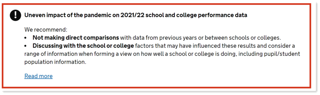
Essentially, don’t compare schools but here’s some data that compares schools.
To recap, we can categorise a school’s performance using thresholds based purely on percentile rank as shown in the accountability guidance. Or a combination of a statistical test and quintiles (lowest/highest 20%) as used in the IDSR. Or a statistical test and deciles (lowest/highest 10%) as per ASP. Or, in the case of the performance tables, scrap the bandings for a year because the data are unreliable (but retain them in the IDSR, obviously!). Perhaps we need a consistent approach across all school performance reports.
Or perhaps explore the possibility that placing schools into performance bands – however they are defined – is fraught with risk. To reduce a school’s performance down to a simple red or green box is never going to tell anyone anything about the effect that that school has had on its pupils. Unfortunately, the existence of these bandings inevitably means that they will be viewed as a proxy for school standards: for the quality of teaching, leadership, and the curriculum. They may tell us something about those things or they may not. It is never that simple. For example, scroll back up to the diagram depicting the confidence intervals and take a look at school C. The confidence interval is entirely above the zero line and the school is enjoying its ‘sig+’ status with an ‘above average’ rating in ASP. Everyone is happy. But note how close to zero the lower limit of the interval is. Remove one child from the cohort and the interval widens just enough to straddle the line. Suddenly our entire perception of the school changes but nothing is different except there are 25 pupils instead of 26. Sometimes the box you fall into is more down to luck than anything else.
When so much data is collected and the stakes are so high, categorisation of schools based on results seems unavoidable, and various organisations have devised their own methods for doing this. Each is flawed, each is open to misinterpretation, and often they contradict one another. This can result wrong conclusions, misplaced priorities, and unfair judgements.
Maybe it’s time for a change.
* There are no performance tables for primary schools this year and, as noted above, secondary performance tables are not using the usual progress bandings. It remains to be seen whether the five band system is retained in ASP reports this year.