How you can you be above average and yet below average? It depends on what average we’re talking about. The mean? The median? The mode? In fact, in the world of school performance measures, what we commonly refer to as average is not an average at all; it is simply the national figure. For example, we may state that the national average attainment at KS2 is 65% achieving the expected standard in reading, writing and maths. What we are actually referring to here is the percentage of pupils in England that have met the standard, as if they are all in one huge school of 650000 pupils. Nothing has been averaged – it’s not a mean, a median or a mode – it’s just the overall national figure. Referring to such a figure as a national average is not normally a problem – everyone knows what it means – but it becomes a problem if that figure is presented out of context, alongside data that it does not relate to.
And this is my problem with quintiles in the IDSR.
The IDSR now shows each school’s quintile position for its results, progress and various contextual factors. A school may find itself placed in the bottom or top quintile, or somewhere in the middle, for its GCSE results or the percentage of pupils with SEND. The quintiles are based on the school’s rank position amongst all other schools (of the same phase) nationally for the particular indicator in question. Aside from the issues raised in the previous blog – essentially quintiles are a blunt instrument – I have no real problem with this approach. What I do have a problem with – and this goes back a long way to the days of RAISE – is the national ‘average’ that is presented alongside the school figure and quintile. It does not relate to the quintile at all and consequently it causes a lot of confusion.
As quintiles are based on the school rank position, the relevant national average here will be the median – the value of the middle ranked school. If we rank all the primary schools in England by their KS2 results or percentage of EAL pupils, it will be the figure of the middle ranked school that will be provide us with the median value for our distribution. However, in the IDSR, it is the overall national figure – that percentage of all pupils nationally – that is provided for reference, and this could be anywhere on scale. The overall national figure may be in the middle quintile – but is unlikely to be at the centre – or it may be in a lower or a higher quintile, and this makes no sense to people trying to interpret the data.
“How can we be above average but below average at the same time?”
The problem is that the 650000 pupils in a national cohort are not equally distributed across schools – some schools are bigger than others – and pupils with particular characteristics, such as those eligible for free school meals (FSM) or those for whom English is an additional language (EAL), are not equally distributed across schools either. They may be, for example, concentrated in a smaller number of larger schools, and there may be a large number of smaller schools – perhaps an entire quintile’s worth – that have no such pupils at all. In short, data sets are skewed and the median, on which the quintiles are centred, may be well above or well below the stated national ‘average’.
This issue is perfectly illustrated by the following graph, which shows the percentage of EAL pupils in primary schools across England plotted against percentile rank. The quintiles are clearly shown.
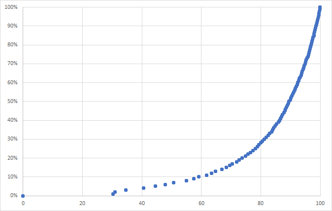
The percentage ranges of EAL pupils for each quintile are as follows:
- Q5 (1-20): 0%
- Q4 (21-40): >0% to 3%
- Q3 (41-60): 4% to 10%
- Q2 (61-80): 11% to 28%
- Q1 (81-100): 29% to 100%
The lower (5th) quintile comprises schools with no EAL pupils, the top (1st) quintile comprises schools with 29-100% EAL pupils, and the middle quintile – that middle 20% of schools – ranges from 4-10% EAL pupils. The median value – the percentage of EAL pupils in the school ranked at the 50th percentile – right in the middle of Q3 – is 7%.
So what?
The problem is that the national average, that sits alongside all this data in the IDSR, is stated as 21%. This is not the median – the middle ranked value of 7% in this case – but the overall national figure, which is completely out of context here. Going back to the graph above, a school with 21% EAL pupils – equal to the national ‘average’ – will be in Q2. In fact, a school with 11% EAL pupils will be in Q2. They will be way below average, but also above it.
The following table provides a simple example, again based on %EAL in each school. We have 9 schools of different sizes with varying proportions of EAL pupils. The national ‘average’ is the total number of EAL pupils divided by the total number of pupils (i.e. 32%) whereas the median – the percentage of EAL pupils in the middle ranked school (5th) is 15%. School 3 with 20% EAL pupils therefore falls in Q2 (above average) despite having a below ‘national’ proportion of EAL pupils.
| School | No Pupils | %EAL | No EAL | Rank |
| School 1 | 900 | 50% | 450 | 1 |
| School 2 | 100 | 10% | 10 | 7 |
| School 3 | 450 | 20% | 90 | 4 |
| School 4 | 150 | 15% | 23 | 5 |
| School 5 | 200 | 12% | 24 | 6 |
| School 6 | 200 | 10% | 20 | 7 |
| School 7 | 1000 | 40% | 400 | 2 |
| School 8 | 100 | 0% | 0 | 9 |
| School 9 | 400 | 25% | 100 | 3 |
| National | 3500 | 32% | 1117 |
The same issue could happen with results and this is more worrying than these examples relating to context. If there were a very large number of small schools achieving high results (consider the percentage value of one child in those cohorts) then this will push the national median value up and a school could find themselves in a lower quintile despite having above national ‘average’ attainment. It’s worth noting that national percentage of pupils achieving the expected standard in reading, writing and maths at KS2 in 2018 – 64% – was just inside the lower boundary of the middle quintile (Q3). The median that year was 68%. Schools achieving national ‘average’ narrowly escaped being classified as below average in the IDSR quintile system.
As with all data, the better we understand it (and are aware of it’s limitations) the better armed we are for conversations with people who perhaps seek to use it against us. Certainly a good test of someone’s data knowledge is to ask them:
“How can I be above and below average?”
I wonder how many can answer that question.