On the face of it, it looks like an improvement. The closing the gap report in last year’s RAISE seemed like an afterthought and once you’d been through the main report you knew it all anyway. I never really saw the point in it. But this year it’s changed: 3 year trends for expected and better than expected progress, VA, APS, and L4/5+ reading, writing and maths, all in one neat 2 page report. What’s not to like? I actually thought it was a useful addition, until someone asked me about the red.
“Erm, red?”
It turns out the two RAISE reports I’d briefly looked at didn’t have any red so I’d not really had cause to read the blurb. Well, I’ve been busy. That’s my excuse.
So I looked at some other reports.
“****!”
I don’t want to go into too much detail about the method as it’s already been covered in depth here: http://peterjnye.wordpress.com/2014/10/31/raiseonline-closing-the-gaps-and-the-introduction-of-shading/
And if you want to read the DfE guide, it’s here: https://www.raiseonline.org/OpenDocument.aspx?document=298
I just want to share one table from a primary school’s RAISE report and have a bit of rant. Check this out:
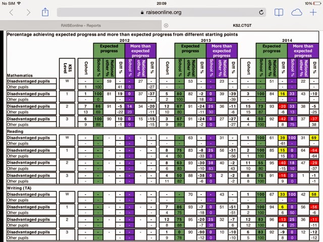
Here it is in all it’s glory, with plenty of red. Just to clarify – in case you’ve not read the blurb yet – red indicates where the figure for disadvantaged pupils is lower than that of non-disadvantaged pupils nationally, and the difference is greater than the % value of 1 pupil in the group. There’s no significance test, no confidence intervals, no standard deviations. Just a big, red flashing light. And only disadvantaged pupils get a red light by the way, and only in 2014. Obviously. And no one get a gold star, which kind of sucks.
So, have a look at the table again, and focus particularly on the top section (maths) and on the disadvantaged pupils that were level 3 on entry. There were 4 of them. And ONLY half of them – that’s just 2 whole pupils – made 2 levels of progress. I’m shocked. And what’s worse, nationally 92% of non-disadvantaged pupils that were level 1 on entry made expected progress. The difference is -42%. And 42% is greater than the % value of one pupil in that cohort (i.e. 25%). Klaxon sounds, red light flashes, periscope down, “DIVE, DIVE, DIVE”.
4 pupils in the group
Compared against a cohort of around 100,000
So, that stands up.
(I’m guessing about the 100,000, but accuracy is low down the priority list anyway)
Now, have a look at the reading section. Focus on the disadvantaged pupils that were level 1 on entry. There were…….wait for it…….2. And none of them made 3 levels of progress. None. 0%. This just isn’t good enough. And to prove it we are told that, nationally, 64% of non-disadvantaged pupils, with the same start point, made 3 levels of progress.
0% of 2 vs 64% of 64,789 (I totally made that figure up) = -64%
This data could only be improved if Chris Morris was presenting it.
Or maybe David Mitchell.
So, that’s my rant. I hope you’ve enjoyed it as much as I haven’t.
Oh, and in the process of finding my Underground photo above, I discovered that ‘mind the gap, is a whole other internet thing. Best not search at work.
Over and out.